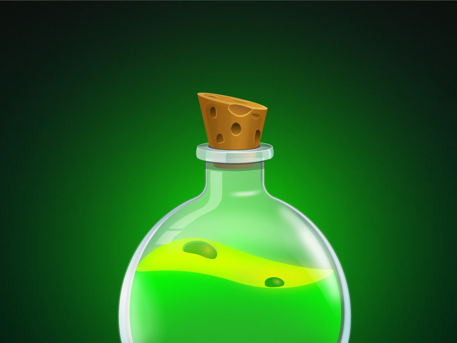
Zooba is a fun cross between battle royale and MOBA game for mobiles - iOS and Android. The purposes of this study case are 1) understating the challenges of translating Zooba’s interface from mobile to desktop/consoles and 2) improving the user flow and experience in various menu screens. The new content consists of mid-fidelity prototypes using some of the existing UI elements.
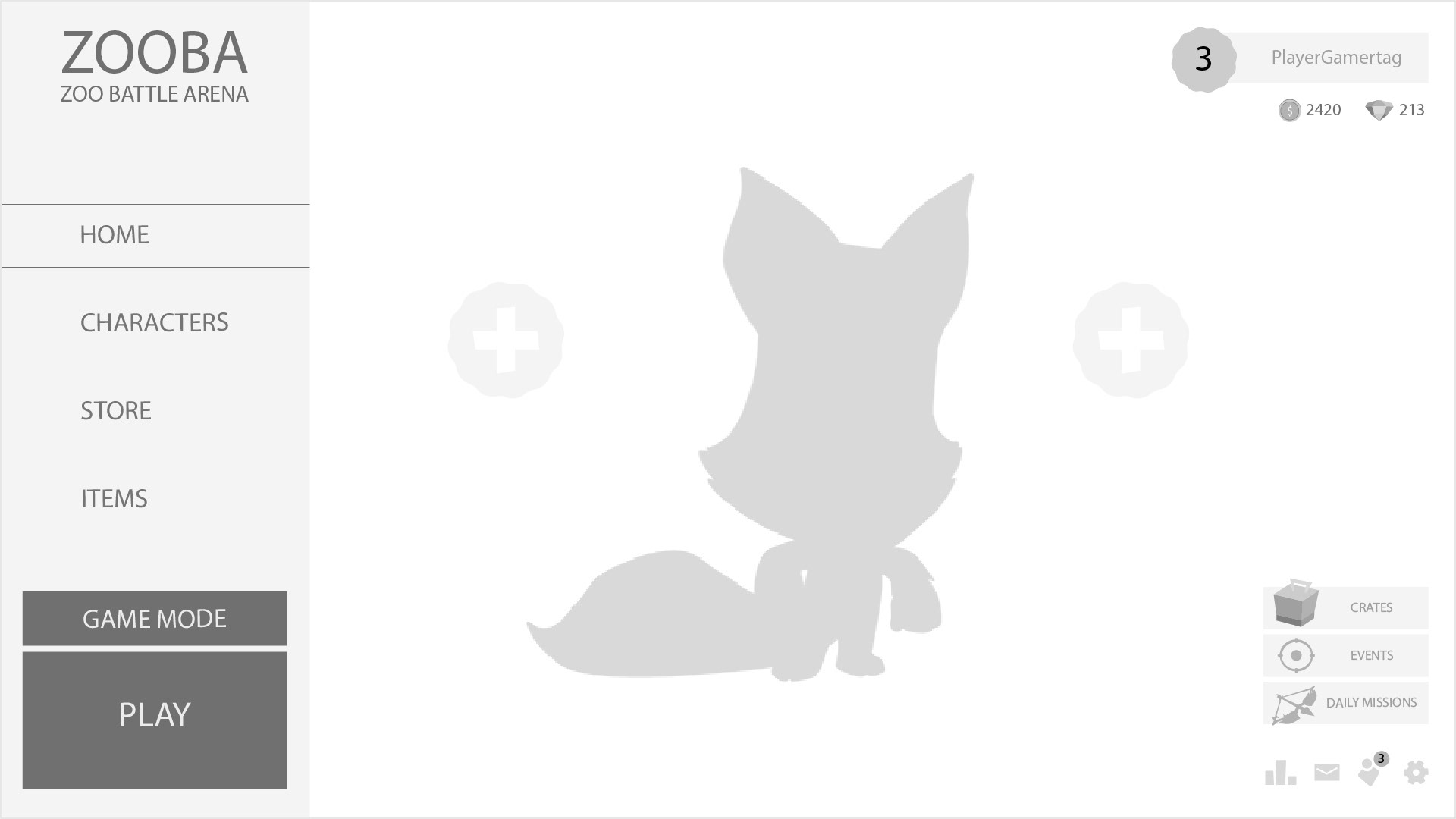
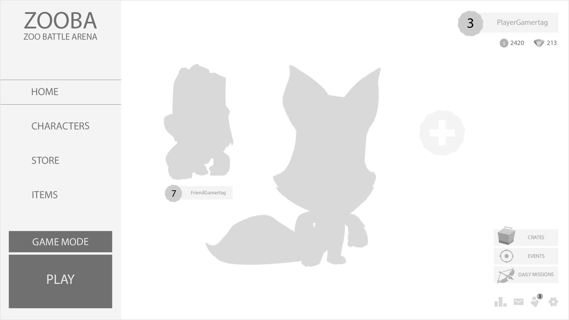
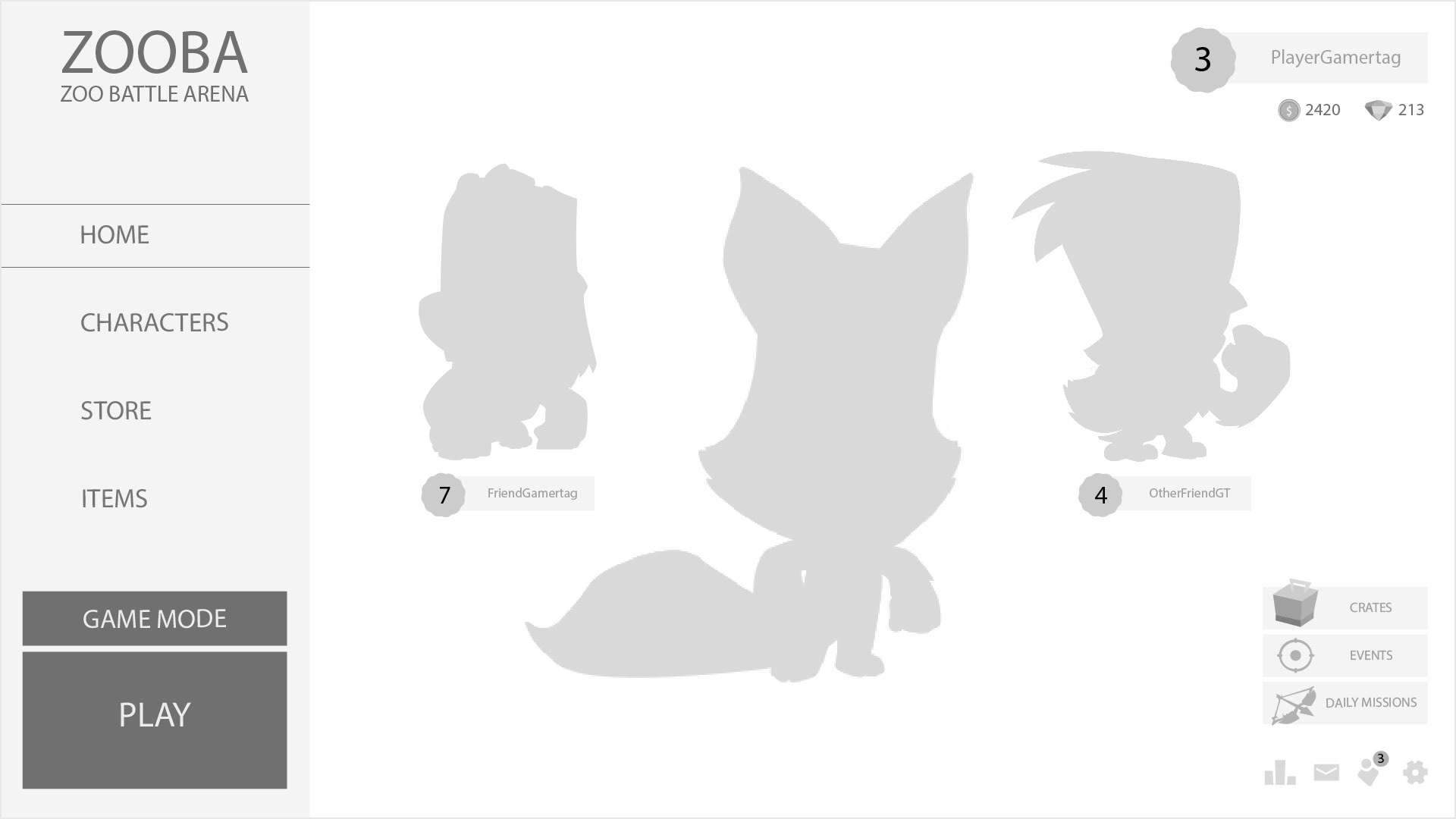
1. MAIN SCREEN
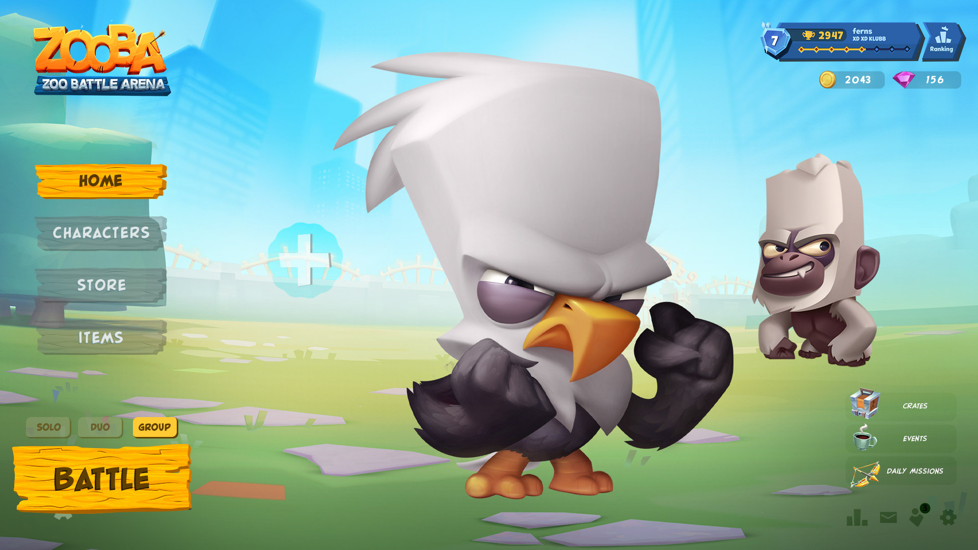
KEY NOTES:
Zooba has been hinting a squad game mode since their launch. Introducing their desktop/console version with the squad game mode as their main mode would make the hype for the release even bigger for its current players, while attracting new users that play similar titles.
Zooba has been hinting a squad game mode since their launch. Introducing their desktop/console version with the squad game mode as their main mode would make the hype for the release even bigger for its current players, while attracting new users that play similar titles.
THOUGHT PROCESS:
My goal while designing the main screen was to make it informative with an efficient workflow. In the mobile version of the game most of the buttons have similar weight, so for the desktop version I changed the hierarchy of the elements to have the user playing the game as soon as possible. The menu one the left delivers more emphasis on the navigation, as the user tends to read the interface from left to right. The characters on the center of the screen will be the next element the user will interact and they won’t be distracted by the far-right elements initially.
My goal while designing the main screen was to make it informative with an efficient workflow. In the mobile version of the game most of the buttons have similar weight, so for the desktop version I changed the hierarchy of the elements to have the user playing the game as soon as possible. The menu one the left delivers more emphasis on the navigation, as the user tends to read the interface from left to right. The characters on the center of the screen will be the next element the user will interact and they won’t be distracted by the far-right elements initially.
2. CHARACTER SELECTION SCREEN
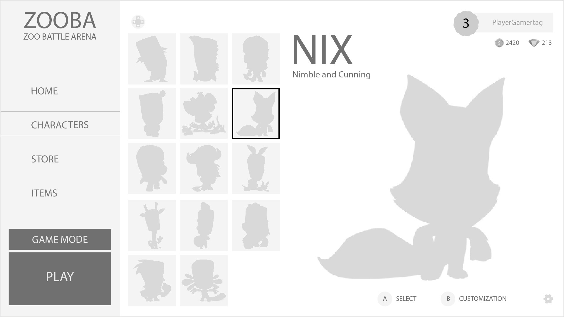
NAVIGATION ISSUES ON MOBILE:
A potential frustrating issue for the users in the mobile version is having to navigate over all the characters to find one in particular. Another issue is the customization button, it is more prominent than the select character button, and thus users may not press the select button before moving to another screen.
A potential frustrating issue for the users in the mobile version is having to navigate over all the characters to find one in particular. Another issue is the customization button, it is more prominent than the select character button, and thus users may not press the select button before moving to another screen.
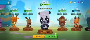
CURRENT MOBILE VERSION OF THE CHARACTER SELECTION SCREEN
THOUGHT PROCESS:
The challenge was improving the navigation flow while having clear indicators of the user current selection and the character the user is checking. The boxes menu layout was chosen because it is not complicated to navigate and it simplifies the task of organizing the characters.
The challenge was improving the navigation flow while having clear indicators of the user current selection and the character the user is checking. The boxes menu layout was chosen because it is not complicated to navigate and it simplifies the task of organizing the characters.
3. STORE SCREEN
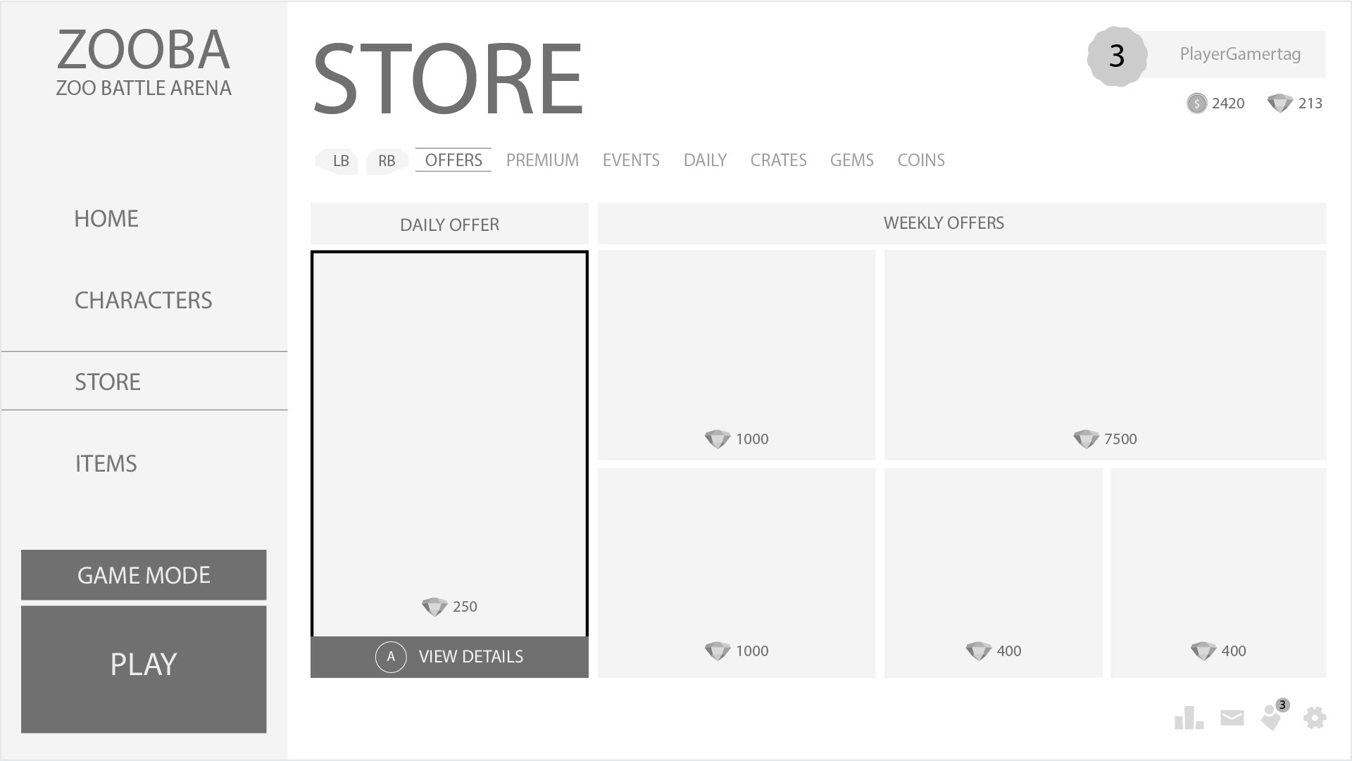
THOUGHT PROCESS:
The store design should be appealing to attract and drive users to purchase. The current Zooba store in the mobile game is visually confusing and does not properly highlight their offers.
The store design should be appealing to attract and drive users to purchase. The current Zooba store in the mobile game is visually confusing and does not properly highlight their offers.
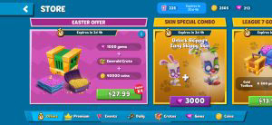
CURRENT MOBILE VERSION OF THE STORE SCREEN
The decision to use a modular grid layout for the store was made because it is simple to customize and allows the design of a complex hierarchy. The main offers are visible and the user is effortlessly able to acquire the skins or packs they want. The sub-menu on top provides more options for the user and extend their abilities to obtain exclusive in game content.
THERE'S MORE TO COME :)